Digital Unboxing

Digital Unboxing

As designers, we strive to make our apps as easy to use as possible. We want our users to love using our apps, to be delighted at their look and feel of them, and to tell everyone that this is the best app they have ever used.


My client’s app is fairly large, with many, many features. This is wonderful because clients can do almost everything they need to do on the go. Unfortunately, this also means that some features could be a little harder to find, even if usability testing told us otherwise. The app has grown so much over the years, but along with its growth, not much has been done in the way of teaching users where to find what. Many users don’t even know about many of the features that they carry in the palm of their hand. And shockingly, some don’t even know how to make a payment.


Introducing: Digital Unboxing

The idea of Unboxing comes from the physical act of unboxing a product that was just delivered to you. Think about the iPhone: the packaging is stunning, it has that “new” smell, and it comes with everything you need such as a power cable, charging brick (in the past), and a little booklet that tells you what’s what.

Digital Unboxing should provide the user with such an experience – a welcome, and a guide to the most asked-for features.


The research

Digital Unboxing has been attempted before, with research, usability testing and concept designs done. However, it was never rolled out. This gave us the chance to build and improve upon work that has already been done.

I did my bit of research, though, to find out what the best practice would be for such an experience, and what to avoid.


UX Design & Concept Phase

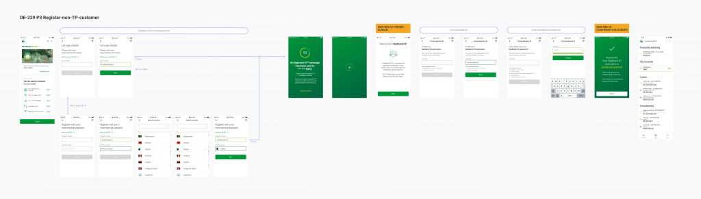
After getting everyone on board with the dos and don’ts, I kicked off with a few user flows to show onboarding steps for a new app user, and to identify spots to insert prompts, how-tos and to-do lists.

I played around with a few flows and wireframes, and improved on the designs as we uncovered more details about the project and what exactly business needed from us to get stakeholder buy-in.


All of the UX work that has been done on the project, so far


A user flow showing possible entry points for unboxing


Wireframes that show what the designs might look like in app
Wireframes with a few component concepts


The Design

This is an ongoing project, and we’ve made quite a few iterations to improve the flow, deciding what is shown when, what it should look like, etc.

UI concepts for unboxing


Tools

Sketch, Miro, InVision


Back to Secret Projects

Colour Accessibility

Colour Accessibility

While my client strives to make their product as accessible as possible, we noticed the colour contrast of our UI library components was not high enough. In order to be completely WCAG 2.o compliant, normal text should have a colour contrast ratio of at least 7.1. I complained about this quite a bit to my design lead, knowing that the library team would need to fix the colour issues, and, as they say, the squeaky wheel gets the oil.

In this case study, I compared the colour contrast of our UI library components to the WCAG 2.0 standards, to see whether my hypothesis was correct, and tweaked the colours just enough to reach at least AA level, and AAA level where possible.


Objectives
  1. Research the colour contrast ratio required for all elements (large text, small text and graphic elements).
  2. Document the colour contrast ratio of our current colour scheme.
  3. Propose new colours with a higher contrast ratio and apply the new colours to existing components as an example.
  4. Document findings to get stakeholder buy-in and approval.
  5. Hand over to the development team for implementation thereof.


Research & Comparison

Not long before starting on this project, I began a course on accessibility on Interaction Design Foundation. Remembering that Frank Spillers covered colour contrast and WCAG guidelines, I went back to the lesson to kick the research step into high gear. I noted down all that applied and jumped straight into checking the colour contrasts.

I made a simple chart with our neutral colour scheme and noted each one’s contrast ratio, along with their compliance level. From there it was a simple exercise of finding a lighter or darker shade that would reach at least an AA or AAA compliance level.

Colour contrast chart showing WCAG 2.0 compliance scores


Documentation & Proposal

Once I was happy with the shades, I applied them to our main components, such as input fields, buttons, tables and even empty state screens that contained only text. The documentation was a PDF file which contained the colour contrast chart with the WCAG 2.0 score levels, my findings clearly stated, new proposed shades and component examples.

Summary of WCAG compliance test findings

Concepts of components with WCAG compliant colour contrast (part 1)

Concepts of components with WCAG compliant colour contrast (part 2)


Development handoff

I applied the new shades to our online banking and app dashboards and uploaded them to a prototype, and shared this along with the documentation with the development team.

Unfortunately, the old colours are still visible in some of the older parts of the app and online banking, but I am pleased to say that the Digital Design team are focussed on ensuring visual accessibility in all their designs.


Tools

Sketch, WebAim contrast checker, InVision

Multi-Platform Search

Multi-Platform Search

These designs are concepts that I created for a multi-feature banking app.


Objective

Create a search functionality that would allow a user to search for anything on the app, but includes results for the online banking portal.


Research

The research for this project was done by an amazing UX Designer. Having good research to build upon is important for not only creating good designs but also to back up the decisions you have made based on the findings. I did some further research on best practices for displaying search results such as using focus states and how many results can be shown without causing cognitive overload. Findings proved that it is best to categorise search results as clearly as possible, especially for a big website.


The concepts


Wireframe concepts of a search functionality for a multi-feature banking app


Tools

Figma

Chat Feedback

Chat Feedback

While working for one of the Big 5 banks in South Africa, my design lead tasked me with creating a Net Promoter Score rating and feedback system for the chat feature on their app and online banking portal. While the chat feature had existed for a while, there was no way for clients to officially provide their feedback. At the same time, the bank was not getting accurate feedback from clients in-branch.


Research

I started by gathering the open working files for the chat designs. Creating a feedback system is simple enough, but I wanted to do it right. While discussing the existing rating system that is used in the branches with a stakeholder, they explained that the feedback they get is a little garbled: clients would select a bad score (1) and comment that the banker’s assistance was outstanding, or they would choose a rating of 5 and complain about how horrible their experience was in-branch.

This meant only one thing: it was not clear whether a score of 1 was good, as in, this person is number one, or bad, as in 1 out of 5 stars. I wanted to see if there were any best-practice papers on this on the web, and I found wonderful resources on tests done previously. However, we needed to conduct our own usability test to validate or disqualify my desk research. The results were surprising, with 100% of clients understanding that 1 is a bad score and 5 is a good score. This baffled me, but unfortunately, I couldn’t spend any more time on usability tests and had to come up with a design that would satisfy all user types.

While the results on the 1-5 score were a bust, the usability test validated our assumptions that the two questions could be understood incorrectly. The testing also provided insights into when clients would take the time to write a review after selecting a score, and why.


Concepts

I created three concepts: emoticons, stars and thumbs up and down.

While star ratings are relatively commonly used, the emoticon design was the most beneficial for the use case, and the least likely to fail. Because we needed a score out of five, the thumb rating would not suffice.


Design

We decided to add colour to the emoticons on hover to further clarify their meaning. Since we are in a western country, red generally means bad and green means good. I created a scale from red to orange to green, using the colours we already had in our design system.

Examples of the colour blindness test results

I ensured the visual accessibility of these colours by putting them through various colour blindness tests and used these results to reassure stakeholders that these colours are indeed accessible. However, I am ashamed that, while I knew that the contrast of the faces against these colours is not high enough, I decided to stick with the choices I have made because the faces are visible before hovering over them. As for screen readers, the developers ensured that tagging of the icons are clear.

I worked closely with copywriters to reword the questions that were so famously misunderstood by our usability testing respondents and re-tested them using the guerilla method, as time limits did not allow a second usability test.

For the comments section, I proposed a radio-selection design with the option to add their own comments. While this was well received by stakeholders, the developers informed me that they could unfortunately not change the functionality of the feedback form, and they could only change the wording of the questions. Therefore, I stuck with the original design of a comment box. However, this was still well received by clients and the feedback they were getting was making sense again.


Tools

Sketch, InVision, Coblis Color Blindness Simulator

App login & registration

App login & registration

I joined a small team of designers at one of the Big 5 banks in South Africa to work on a very specific feature: login and registration. While we focussed on the app, online banking and a progressive web app, I am going to cover only the work that we did on the app, here.

I joined the team in a UI Design capacity.


Team objectives
  • Creating a seamless registration process that satisfies both security and usability concerns.
  • Creating simple login flows that will allow the user to log in with biometrics, a password or a PIN.
  • Enabling the user to change or reset their password and PIN.


Research

Before I joined the team, eight personas were identified and the basic designs for login and registration have already been done. But the work was far from done. I helped the team with work that went far beyond our scope, including but not limited to an interactive app demo, error handling, a content page which doubled as a landing page and working with the Sun City Nedbank Golf Challenge team to create content that will draw viewers.

I was introduced to usability testing during this time and got to do best practice research for the app demo feature.


App login redesign

The original app login flows were very limiting and very dark. We wanted to add an airy feel to the designs, along with improving the overall login experience.

Before the redesign, the login flow allowed users only one login method, with their account password as a backup option. We added much more flexibility by allowing them to switch between biometrics, a password or a PIN. We also added a content screen displayed upon app launch, which would advertise the latest events, such as the Nedbank Golf Challenge, and products that the client might be interested in.


The login screens were very dark before the redesign
The login screens were light and bright after the redesign, with lots of white space.
After the redesign, the login screens were light and bright with lots of white space


We also added much-needed error handling, as well as options to reset a PIN after entering it incorrectly three times. Previously, the client’s account was blocked and they had to go to a branch to have it unblocked.

We used facial recognition software that smoothly integrated with the Department of Home affairs to identify and verify the user, so that they could reset their app PIN safely.

High fidelity UX flow of a client entering the wrong PIN three times
UX flow showing the steps a user would follow to reset their app PIN after entering it incorrectly three times (click to enlarge)


App registration improvements

For years, only clients that had a bank account with Nedbank could use the app. There was no app access or usage for those who had loans, investments, or any other non-transactional products. We changed this by introducing what we labelled Non-TP registration. A Non-TP client would be a Nedbank client who has never had a TP (transactional product) with Nedbank. This was quite the process, as we had to get stakeholder buy-in, proving to them the benefits of allowing a client with a Nedbank investment product or home loan to use the app.


The challenge

Historically, all TP clients would receive a generated profile name, a password and a PIN (PPP). These were the details that they would use to log on to the online banking platform and the old banking app. Before I joined the team, this functionality was used as-is to allow users to register on the “new” app with PPP verification and set up their preferred login details shown above.

However, Non-TP clients did not receive these PPP credentials so we had to find a new, secure way to allow them access to the app. The simplest solution for this was to skip the PPP verification step. Eventually, this allowed us to completely remove PPP as a verification step, as some user research proved that most clients did not remember these credentials and had kept the physical paper with these details somewhere in a drawer (as I did).

A big win for UX, in my opinion.

High fidelity UX flow of a non-TP app registration
UX flow showing the steps a Non-TP client would follow to register for the app (click to enlarge)


Tools

Sketch, InVision, lots of Sticky Notes 🙂

Icon Set for Pure Malibu

Icon Set for Pure Malibu
I
Final icon set for Pure Malibu


A full set of icons for a beauty products range, Pure Malibu.

The client shared screenshots of their website design, existing icons and references of the style that they like. They requested a full set of icons for product ingredients, product packaging and delivery.


Tools

Adobe Illustrator

Presentation Illustrations

Presentation Illustrations


TenKites needed illustrations to aid in presenting their product to potential clients.

The menu portal allows companies to assist employees in eating healthier meals. Corporate cafés can upload their recipes or menu items to the database, which then display on their online menus to their employees. Employees can use the app or website to order food and track their eating habits. These eating habits are then shared with the employer to keep track of trending menu items and have an overview of the overall health of their employees.

Tools used:
Adobe Illustrator