Colour Accessibility
While my client strives to make their product as accessible as possible, we noticed the colour contrast of our UI library components was not high enough. In order to be completely WCAG 2.o compliant, normal text should have a colour contrast ratio of at least 7.1. I complained about this quite a bit to my design lead, knowing that the library team would need to fix the colour issues, and, as they say, the squeaky wheel gets the oil.
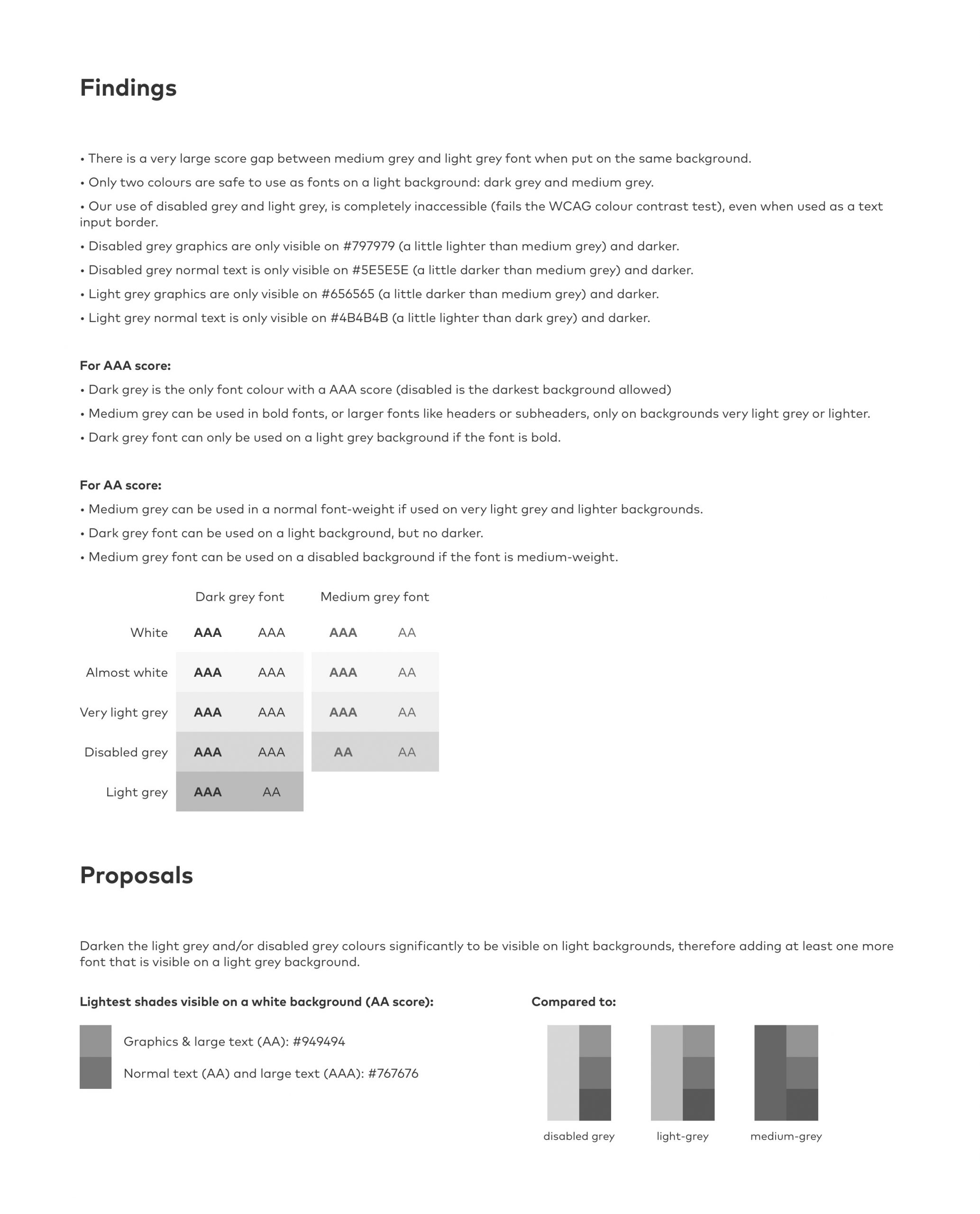
In this case study, I compared the colour contrast of our UI library components to the WCAG 2.0 standards, to see whether my hypothesis was correct, and tweaked the colours just enough to reach at least AA level, and AAA level where possible.
Objectives
- Research the colour contrast ratio required for all elements (large text, small text and graphic elements).
- Document the colour contrast ratio of our current colour scheme.
- Propose new colours with a higher contrast ratio and apply the new colours to existing components as an example.
- Document findings to get stakeholder buy-in and approval.
- Hand over to the development team for implementation thereof.
Research & Comparison
Not long before starting on this project, I began a course on accessibility on Interaction Design Foundation. Remembering that Frank Spillers covered colour contrast and WCAG guidelines, I went back to the lesson to kick the research step into high gear. I noted down all that applied and jumped straight into checking the colour contrasts.
I made a simple chart with our neutral colour scheme and noted each one’s contrast ratio, along with their compliance level. From there it was a simple exercise of finding a lighter or darker shade that would reach at least an AA or AAA compliance level.

Documentation & Proposal
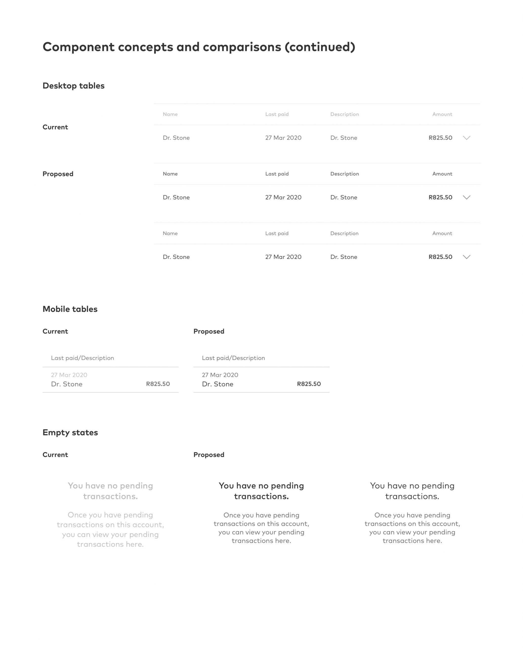
Once I was happy with the shades, I applied them to our main components, such as input fields, buttons, tables and even empty state screens that contained only text. The documentation was a PDF file which contained the colour contrast chart with the WCAG 2.0 score levels, my findings clearly stated, new proposed shades and component examples.
Development handoff
I applied the new shades to our online banking and app dashboards and uploaded them to a prototype, and shared this along with the documentation with the development team.
Unfortunately, the old colours are still visible in some of the older parts of the app and online banking, but I am pleased to say that the Digital Design team are focussed on ensuring visual accessibility in all their designs.
Tools
Sketch, WebAim contrast checker, InVision


